The Best Homepages Online: 16 Inspirational Examples

Last Updated Jun 25, 2020
Last Updated Jun 25, 2020
The homepage is the most important page on your website.
It’s where most of your traffic will land, and where new visitors will form their first impressions of your business.
And first impressions are everything.
To help you create excellent experiences for EVERY new visitor to your site, we’ve pulled together 16 of the BEST homepages by some of the top online businesses and brands to provide you with some inspiration and key takeaways.
Let’s dive right in.
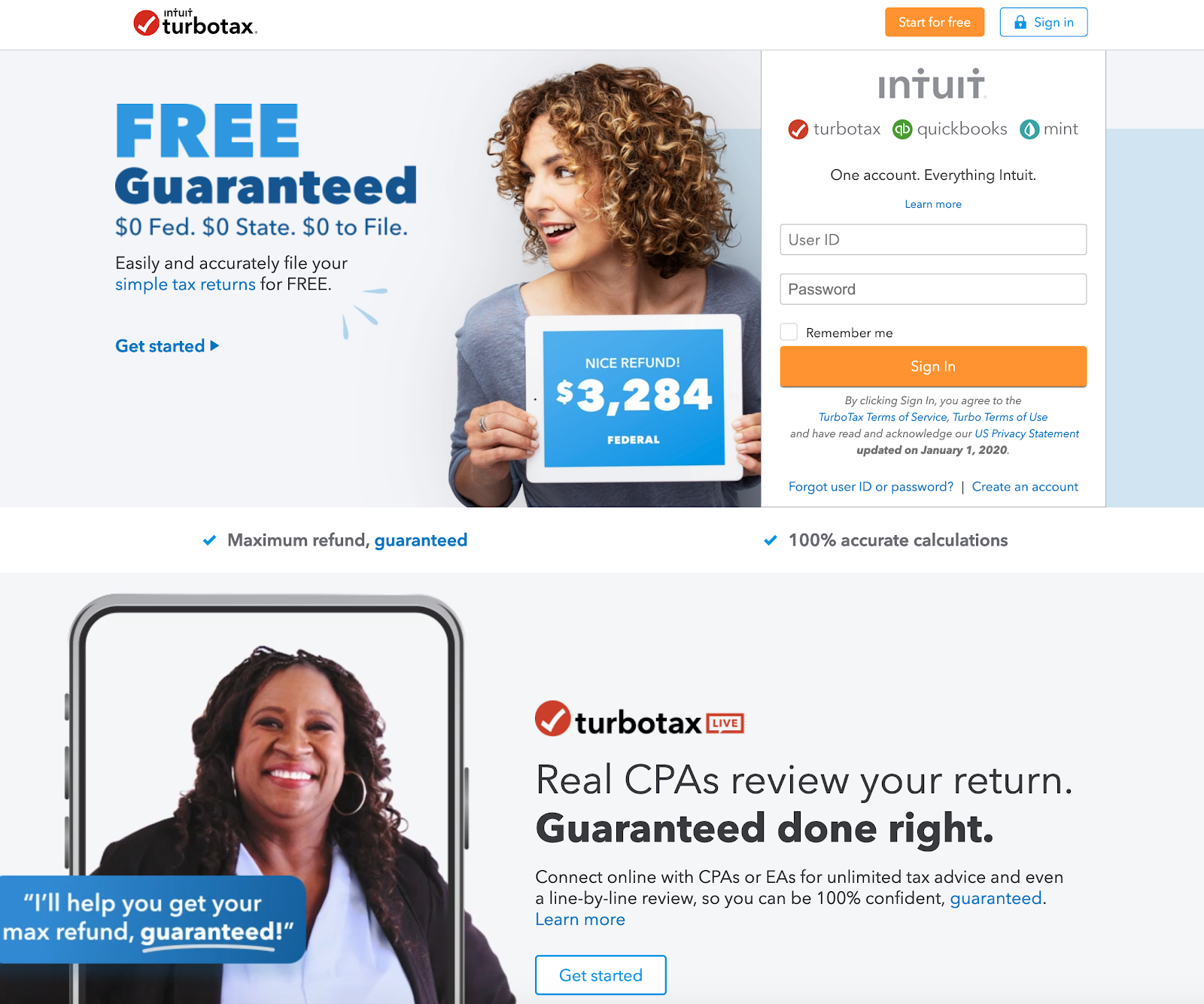
The TurboTax homepage is great because it opens with an irresistible offer that speaks directly to their target customers: “Easily and accurately file your simple tax returns for FREE.”
It’s also great how they make it feel personal with an image of a real CPA (Certified Public Accountant) promising to help you. This helps to build trust with the visitor. The copy also mentions a "line-by-line review" to give visitors confidence that TurboTax will deliver on its promises.
Takeaway: Try to make your offering compelling. Think: “How can I make visitors an offer they can’t refuse?”
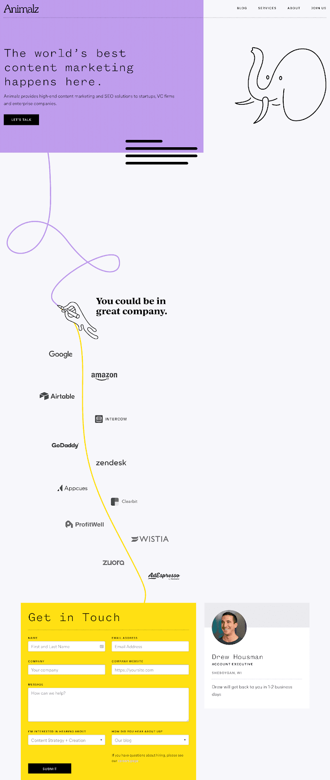
Animalz is a content marketing agency. Its homepage is one of the best in the business. Here’s why:
It starts with a clear description of what Animalz does: “The world’s best content marketing happens here.”
The page then flows nicely as the readers' eyes follow a hand drawing a line down to some social proof featuring Animalz clients like Google, Wistia, and Appcues.
The homepage closes with a CTA box to get in touch with the team, shows you who you’ll be talking to, and when you can expect a reply. This is a great way to set expectations.
Takeaway: Take your website visitors on a journey: Tell them what you do, include some proof, and offer them a way to move forward with you.
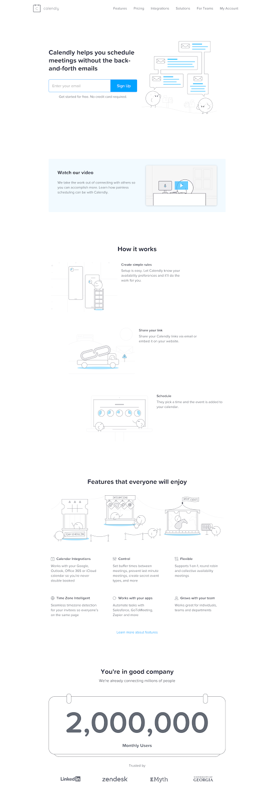
The Calendly homepage opens with copy designed for its target customers. Everyone knows the pain of organizing a meeting over email and Calendly addresses this head-on with its hero copy:
“Calendly helps you schedule meetings without the back-and-forth emails”
This tells visitors exactly how its product will help customers. And it follows up this promise by showing how the product works and walking you through how it makes planning meetings painless.
Takeaway:Craft copy that speaks directly to your customer’s pain points.
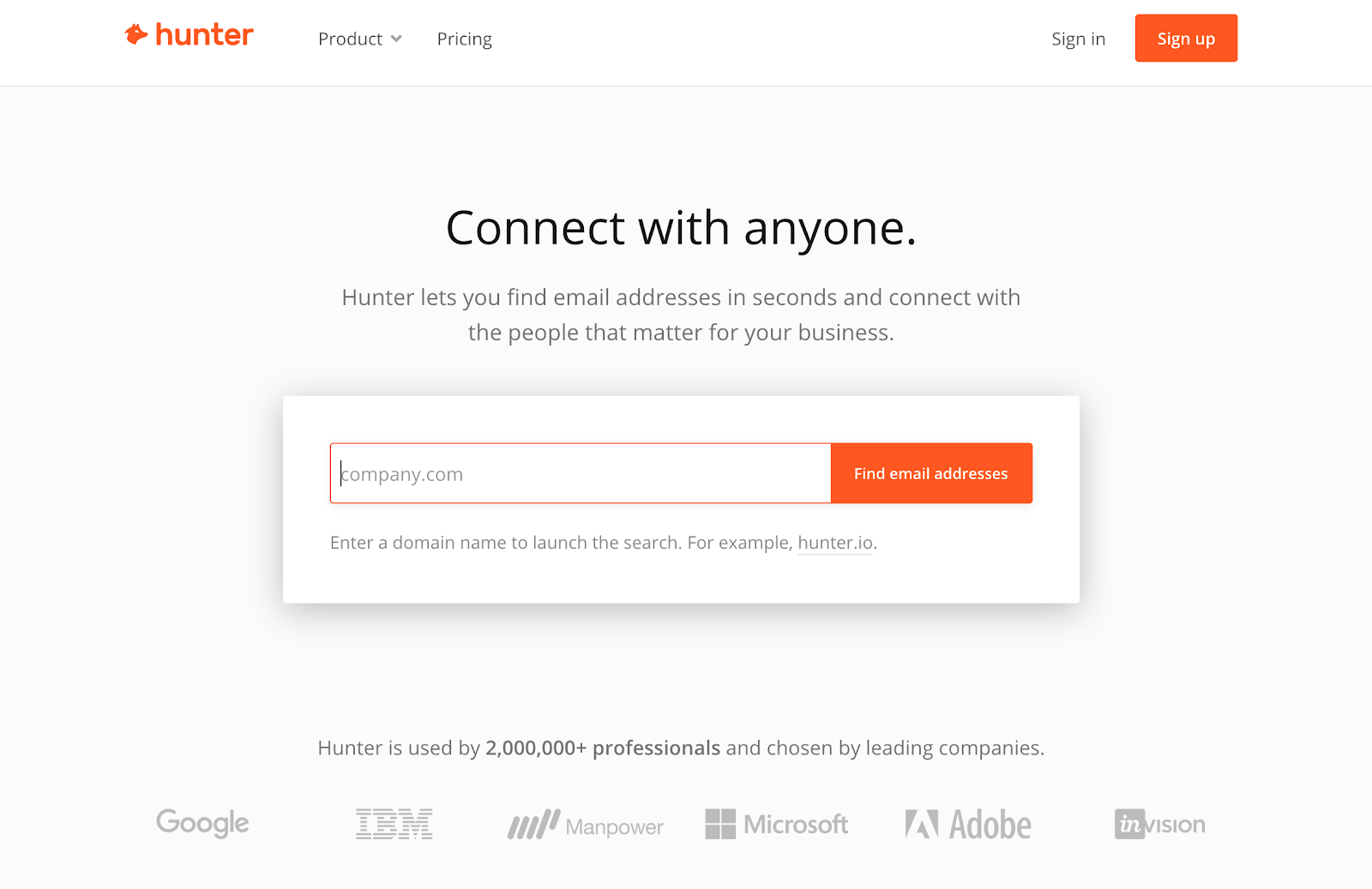
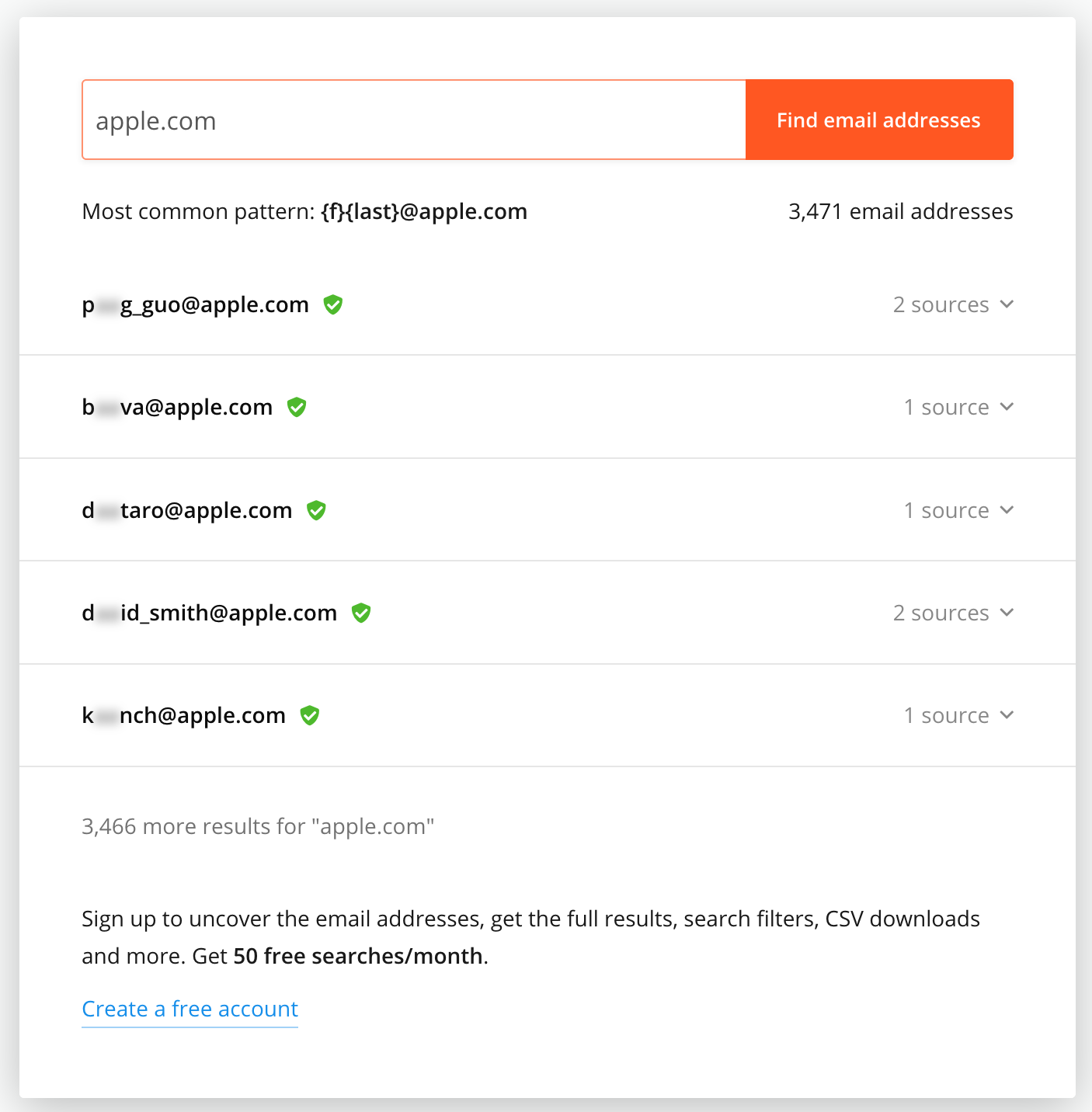
At some point, all of us have to do some form of cold outreach. Hunter is a tool that helps you to find any email address in seconds.
Its homepage is brilliant because it clearly explains the tool's value and uses social proof to show how many people and companies use it. Its CTA drives visitors directly toward seeing the value in its product.
By typing a company into the search box CTA, you’re instantly shown results that will help you to connect with anyone. Here’s an example search for Apple:
Takeaway: Let visitors find the value in your tool as soon as possible.
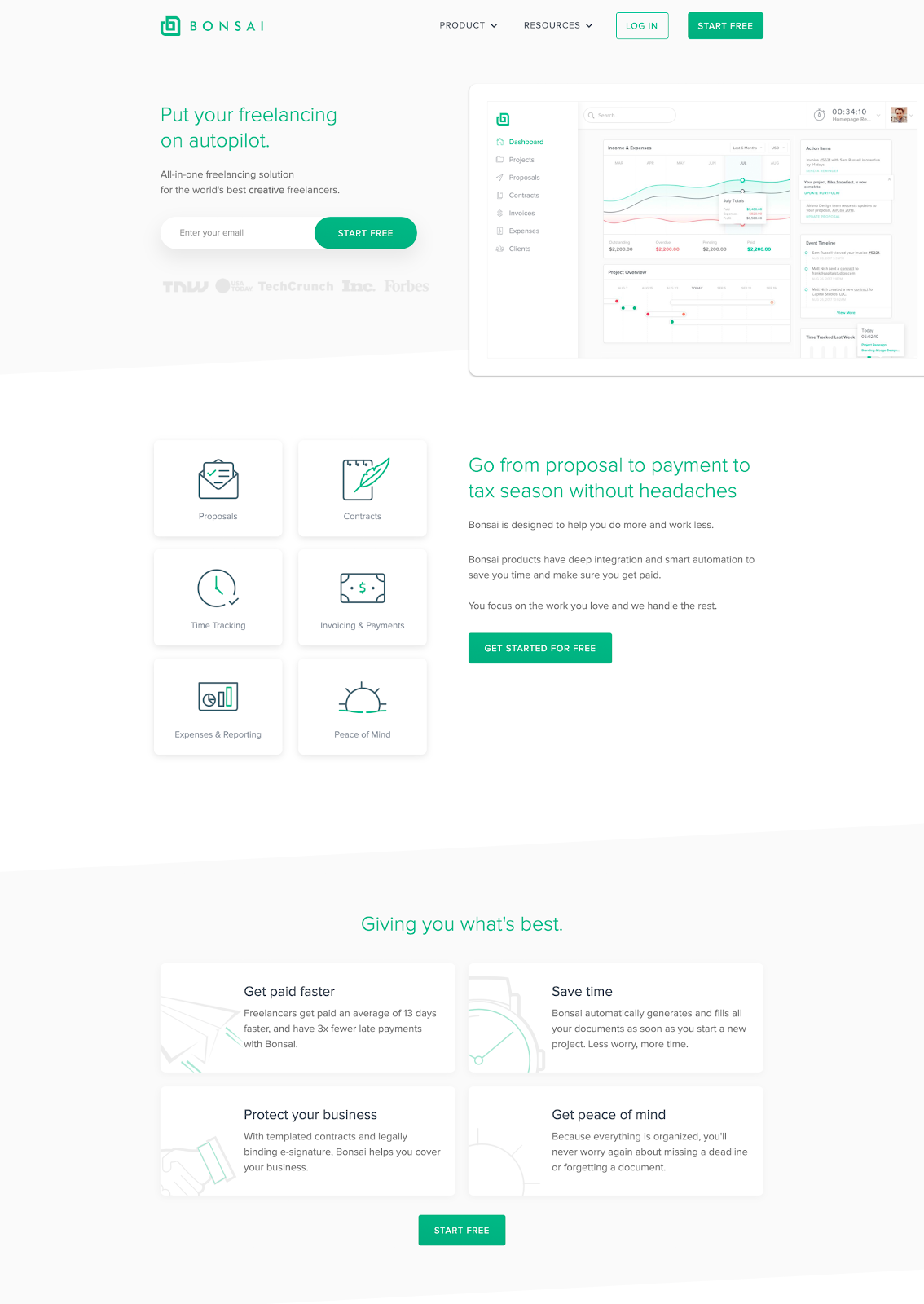
We all have tasks we don’t enjoy. Bonsai’s homepage tells its target customers (freelancers) it will help them spend less time on things they don’t enjoy and have more time for the work they love.
The page clearly lays out the features and how it helps its customers to avoid "headaches" and then identifies the benefits those features enable: Get paid faster, Save time, Protect your business, Get peace of mind.
Takeaway:Don’t just focus on your features, show your homepage visitors the benefits that your customers experience.
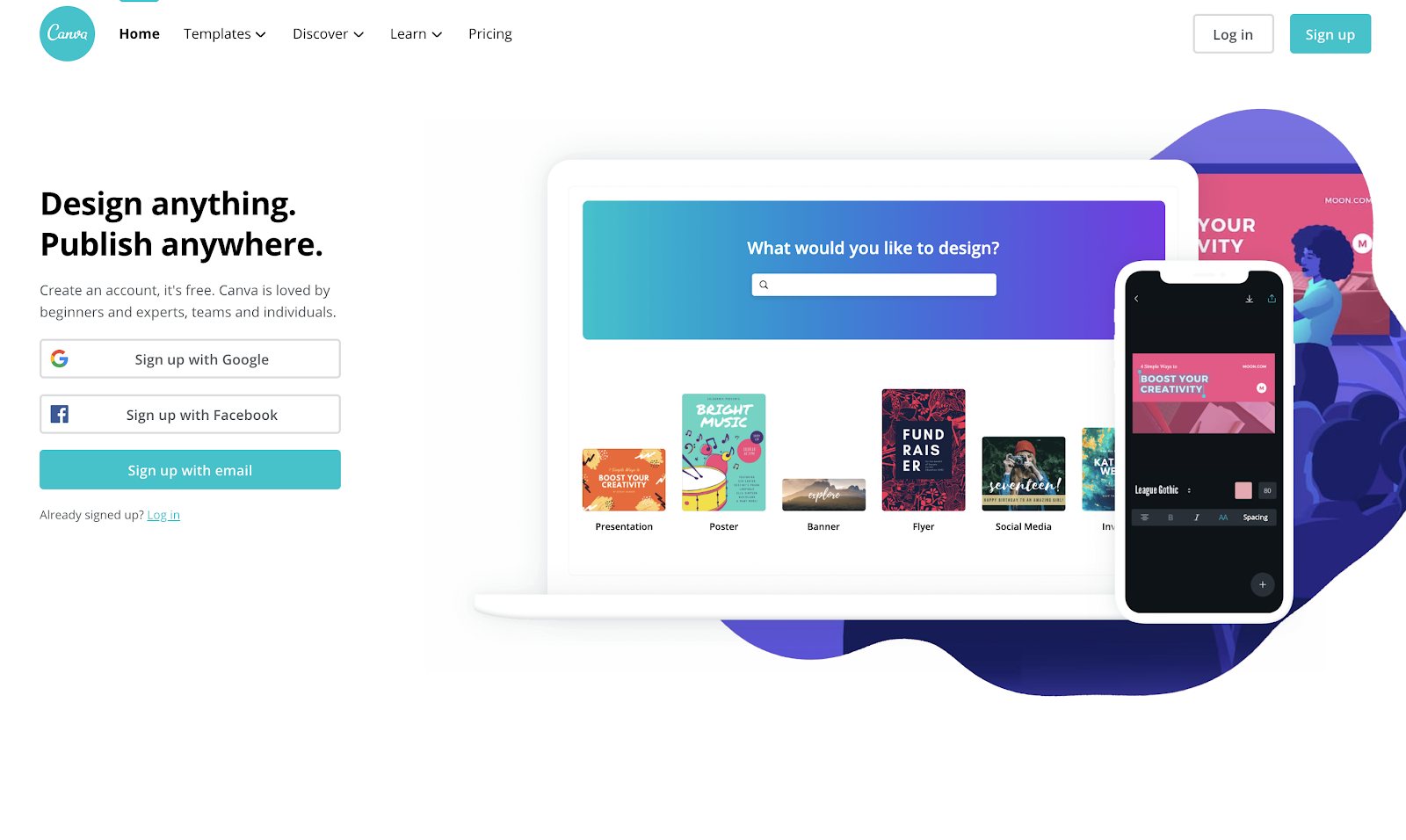
Canva’s homepage is incredibly simple -- this image is the entire page. You don’t have to have a complex homepage with tons of copy and information about your product.
Sometimes less is more. Canva’s homepage shows the product and its versatility (you can design posters, social media content, etc.) and that it can be used on desktop and mobile, all in just one simple screen. No need to scroll.
Takeaway:Keep it simple. It can be tempting to fill your homepage with every detail about your business, but Canva proves you don’t have to.
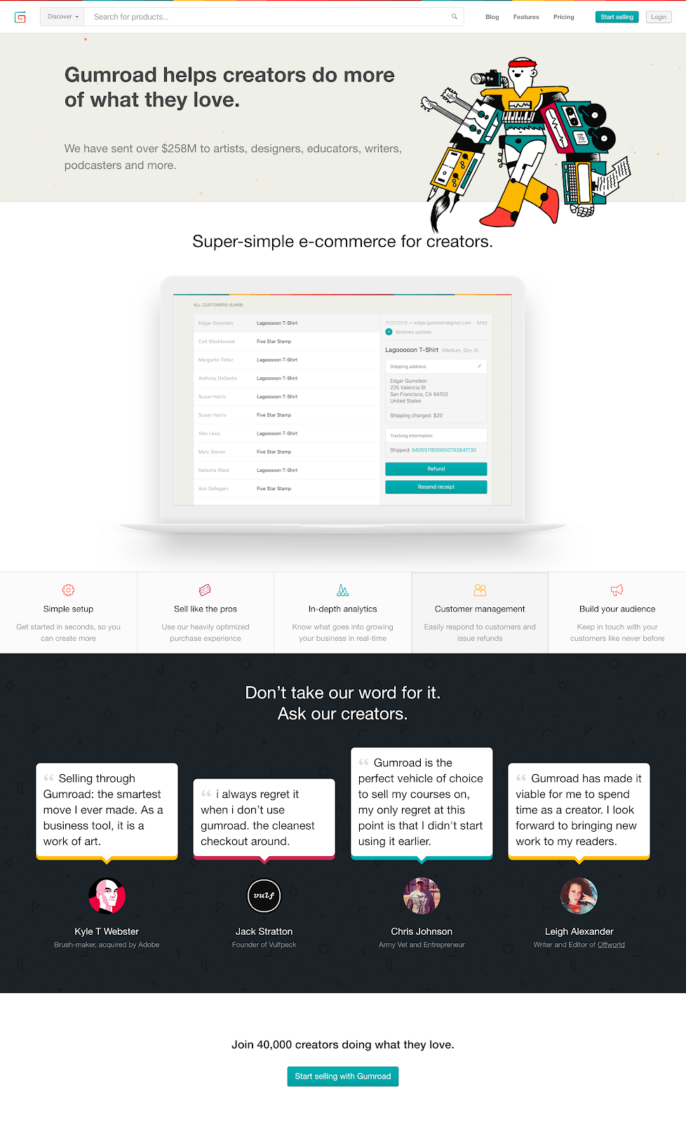
Gumroad is a simple tool for creators to sell their products. Its homepage starts with a clear value proposition and eye-opening social proof: “We have sent over $258m to artists, designers, educators, writers, and more.”
Takeaway:Use a dollar value as social proof. Saying it has helped creators to earn over $258m shows that Gumroad’s product will deliver for its target audience.
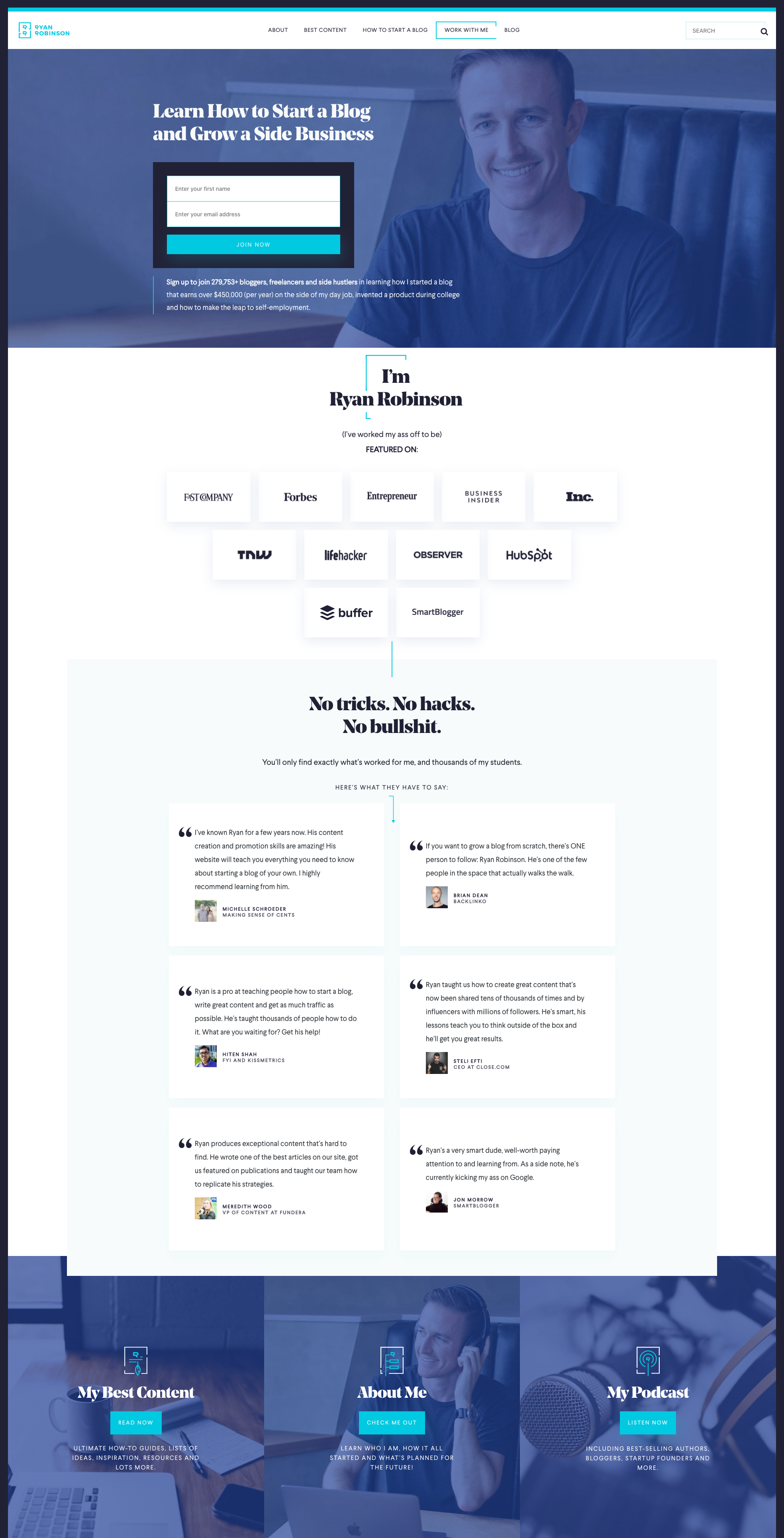
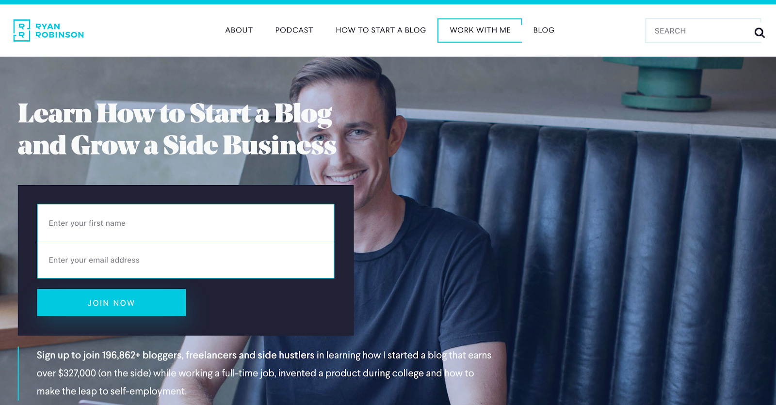
Ryan Robinson’s website is a great example of using social proof. His hero copy and mailing list CTA clearly states how Ryan can help your business, and then dives into a masterclass of social proof.
On his homepage, Ryan uses several types of social proof:
Raw quantity:Under the email capture form, Ryan shares the number of subscribers on his list.
Where you’ve been featured: Below the site's hero section, Ryan lists publications that have featured his work.
Testimonials and quotes: Ryan uses quotes from well-known industry figures to show his experience and build trust with the audience.
Takeaway:Use multiple types of social proof to build trust with new visitors.
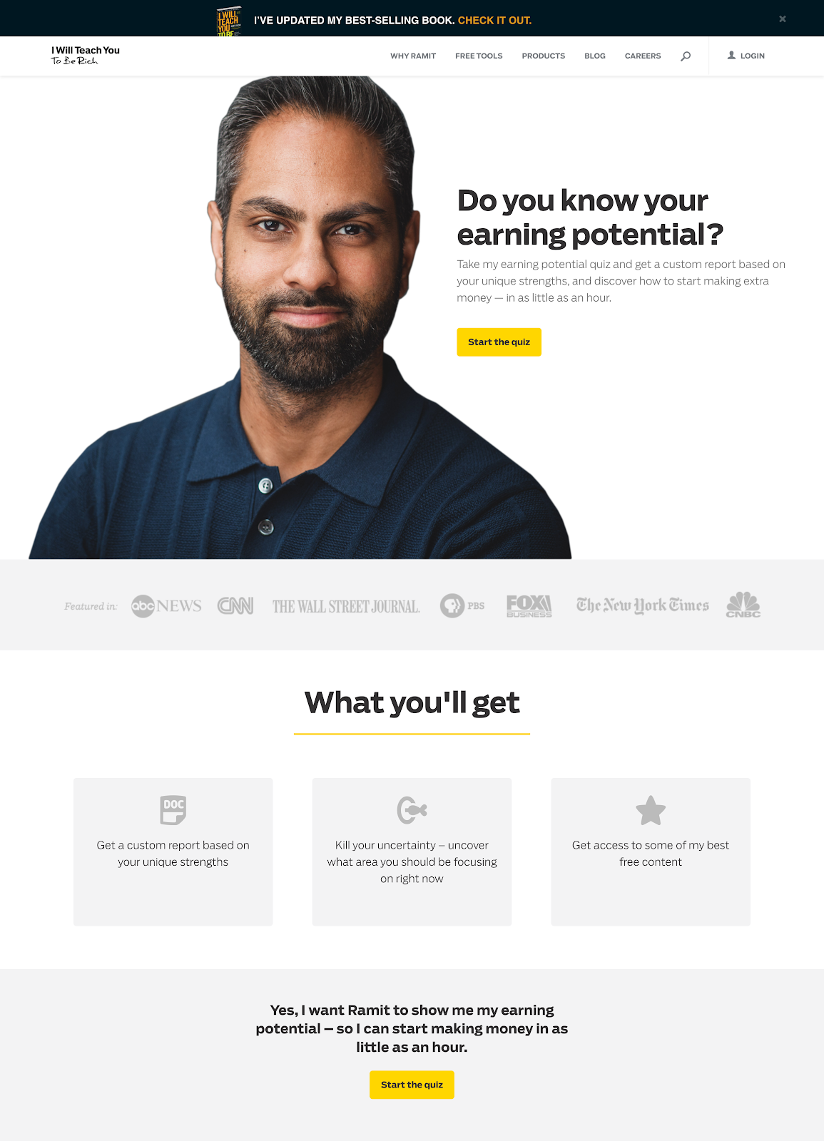
I Will Teach You To Be Rich’s homepage focuses on driving visitors to take an "earning potential" quiz. This quiz is a goldmine for I Will Teach You To Be Rich — to take the quiz, every visitor has to enter their email address. This is the top way the company grows its email list.
The page’s main heading shares a question that visitors can uncover the answer to by taking the quiz. It then features some social proof and gives more information on what you’ll get from taking the quiz.
Takeaway: Think about the top thing you’d like your visitors to do on your homepage.
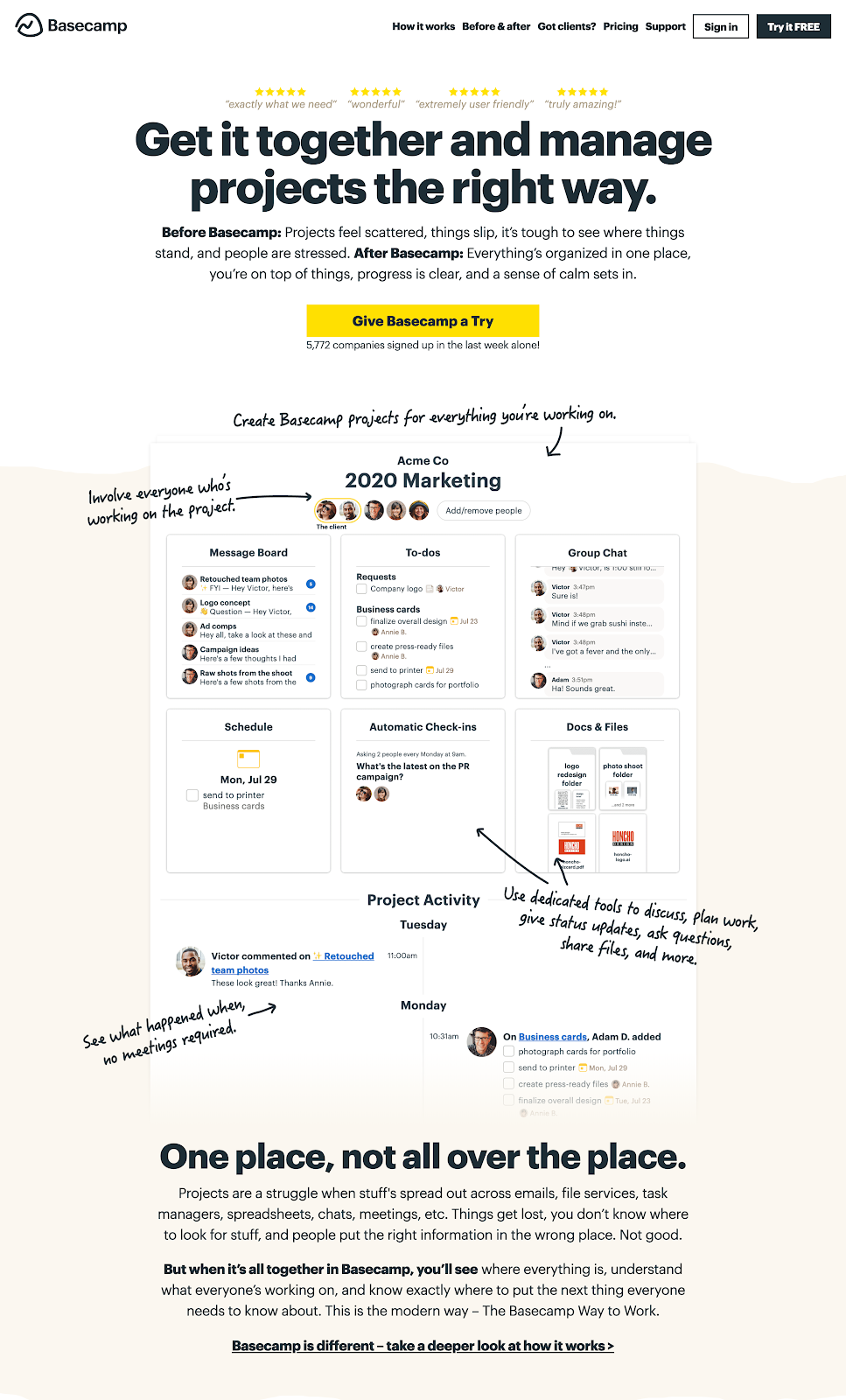
Basecamp’s homepage focuses on storytelling. Its main headline tells visitors what the product will help them achieve, and then it tells visitors a short story of life before and after Basecamp.
It also takes a unique approach to product screenshots by using annotations in a handwriting font.
Takeaway: Don’t just tell visitors how your product or service can help them, show them using engaging stories.
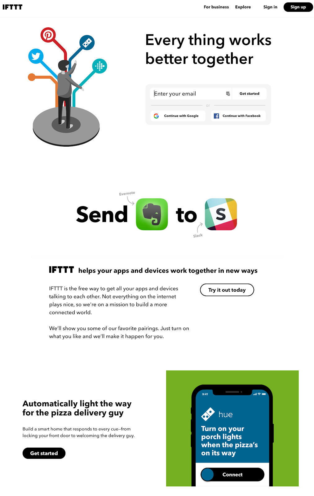
IFTTT lets users connect apps and set triggers based on actions. Its homepage makes the product seem incredibly simple and shows visitors how it can work using clear examples.
It also uses plenty of white space and bright contrasting images to attract visitors' attention and guide them through the page. On Medium, Pratik Hedge explains that white spaces can “help greatly in guiding the users through the page and prioritising the focus area for the user.”[*]
Takeaway:Make the most of white space to guide visitors through your homepage and to give each piece of content room to breathe.
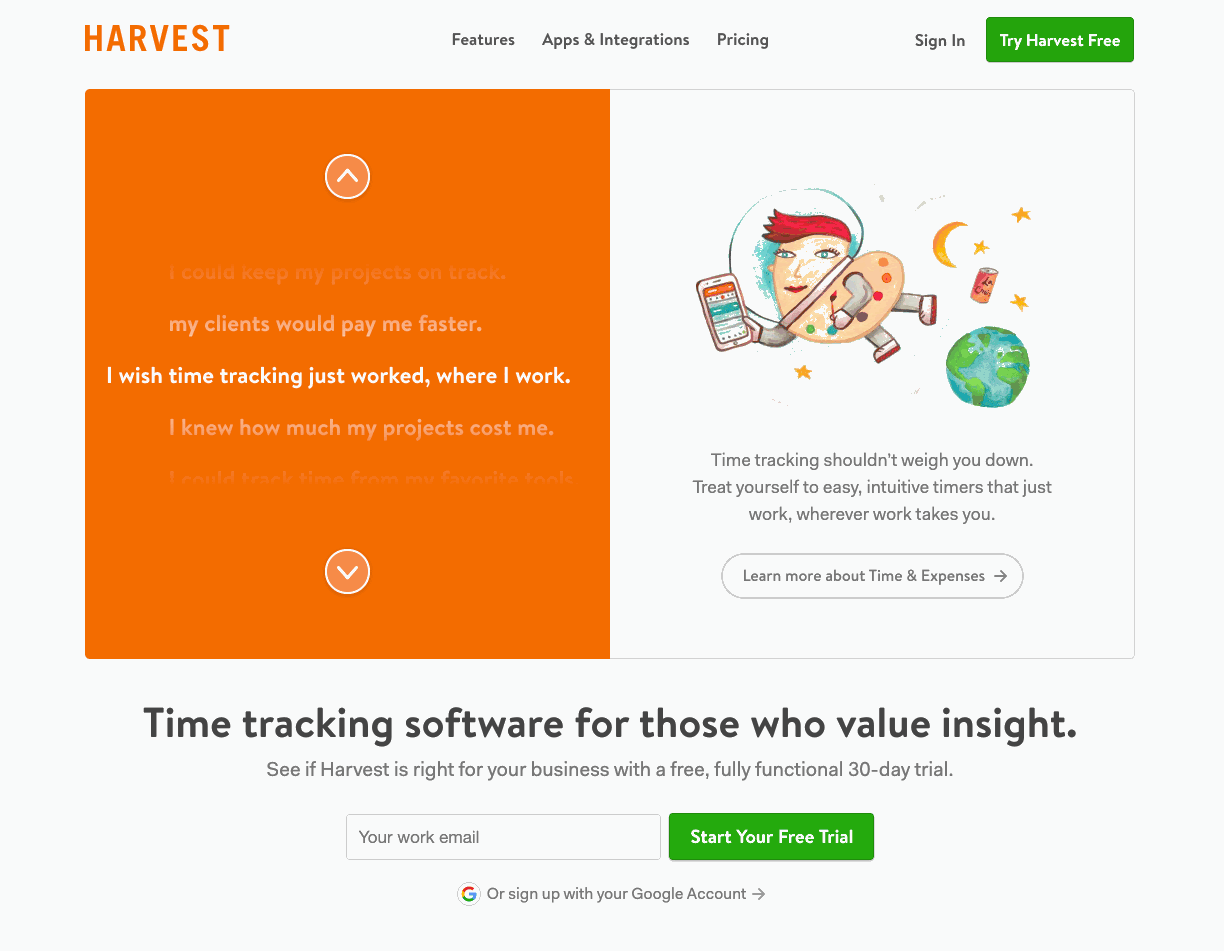
Harvest is a time tracking tool and its homepage features a unique, interactive list of user problems, including:
I wish I knew how much my projects cost me.
I wish I could track time from my favorite tools.
I wish I had a better way to schedule projects.
When each statement is selected, Harvest shows visitors how it helps to solve that problem. This is a great way to show people exactly how your product can help them in their day-to-day work.
Takeaway:Think outside the box. Most homepages would create a unique section for each pain point, but Harvest’s approach helps it to save space and capture attention with a novel feature.
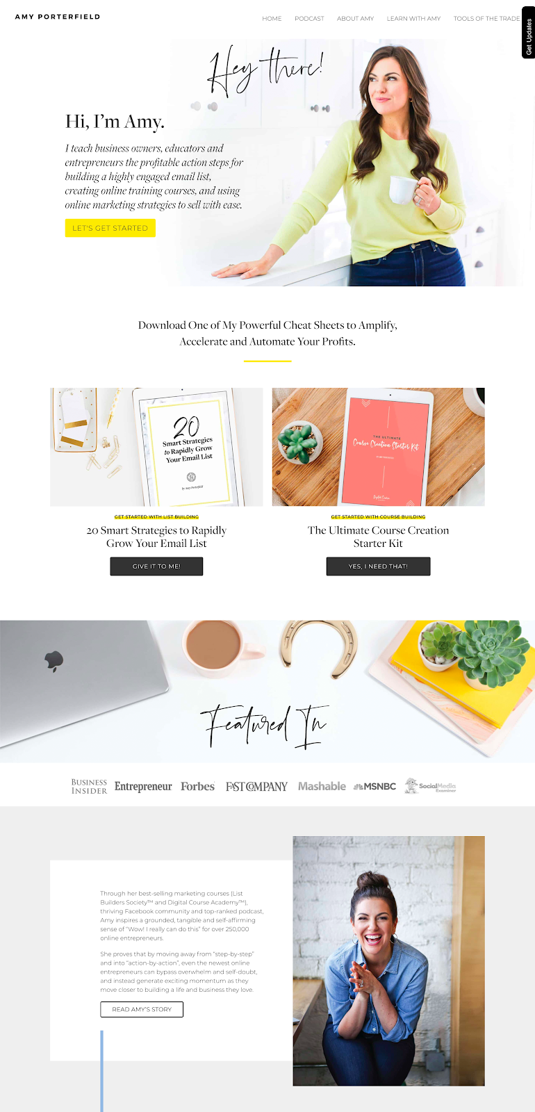
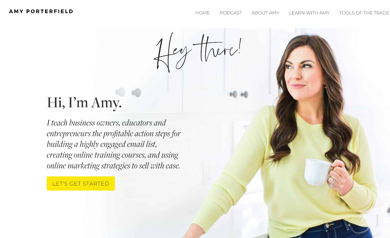
Amy Porterfield’s homepage is one of the best we’ve seen on a personal website. The page opens up in the first person, with Amy telling visitors what she does and how she can help them. The CTA then directs people toward two lead magnets just below the about her section; this is a great way to capture leads.
As visitors scroll, they see social proof from the media outlets that have featured Amy and then a third person professional bio giving more information about Amy’s career and background.
Takeaway: If the goal of your homepage is lead capture, offer multiple lead magnets to help you achieve your targets.
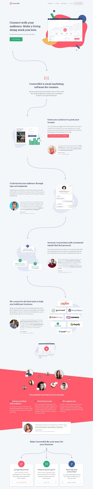
Like the Animalz homepage we featured earlier, ConvertKit takes visitors on a journey to show them how their product works.
The page also wraps up with three CTAs based on visitor needs:
For beginners, it offers a free guide on email marketing (lead capture).
If you’re looking to switch tools, it drives you toward the pricing page.
For visitors interested in advanced features, it asks you to request a demo.
Takeaway:Give your visitors options, especially if you serve customers that will be interested in different price points. Don’t try to drive everyone into the same funnel.
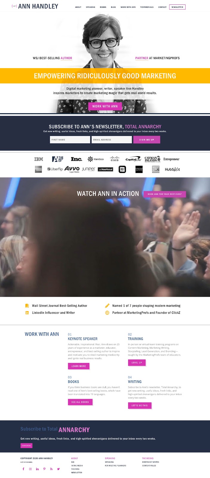
Ann Handley is a renowned writer and marketer — this homepage gets that across loud and clear through the headline copy “Empowering Ridiculously Good Marketing” and the social proof showing some of the brands she has worked with.
If that isn’t enough for you, a little further down the page, Ann shares some of her achievements, including: “Wall Street Journal Best-Selling Author” and “Named 1 of 7 people shaping modern marketing.”
Takeaway: Don’t be afraid to let the world know what you’ve achieved; it is a great form of social proof and can instantly help to build trust.
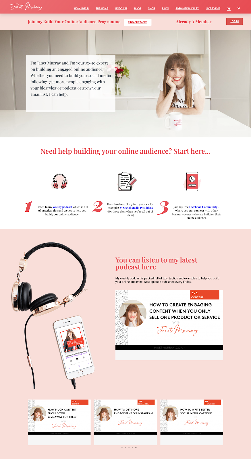
Janet Murray is a marketer and podcaster. This homepage is great because it clearly outlines her specialty “building an engaged online audience” and gives visitors three clear steps to take on her site:
Listen to the podcast
Download a free guide
Join the community
All these steps result in growing Janet’s audience across various mediums (podcast, email, Facebook) and lets visitors choose which option is the best fit for them.
Takeaway: Provide options to visitors. Not everyone will listen to podcasts or enjoy email newsletters. By giving visitors options of how to connect with you, you might be able to increase your chances of conversion.
Okay, so we’ve reviewed some of the BEST homepages we’ve found online.
While selecting these 16 homepages, we viewed hundreds and hundreds of websites, and this process helped us to narrow down five key elements of a great homepage.
When someone visits your homepage, they are on a journey, and your homepage should help them progress to their destination.
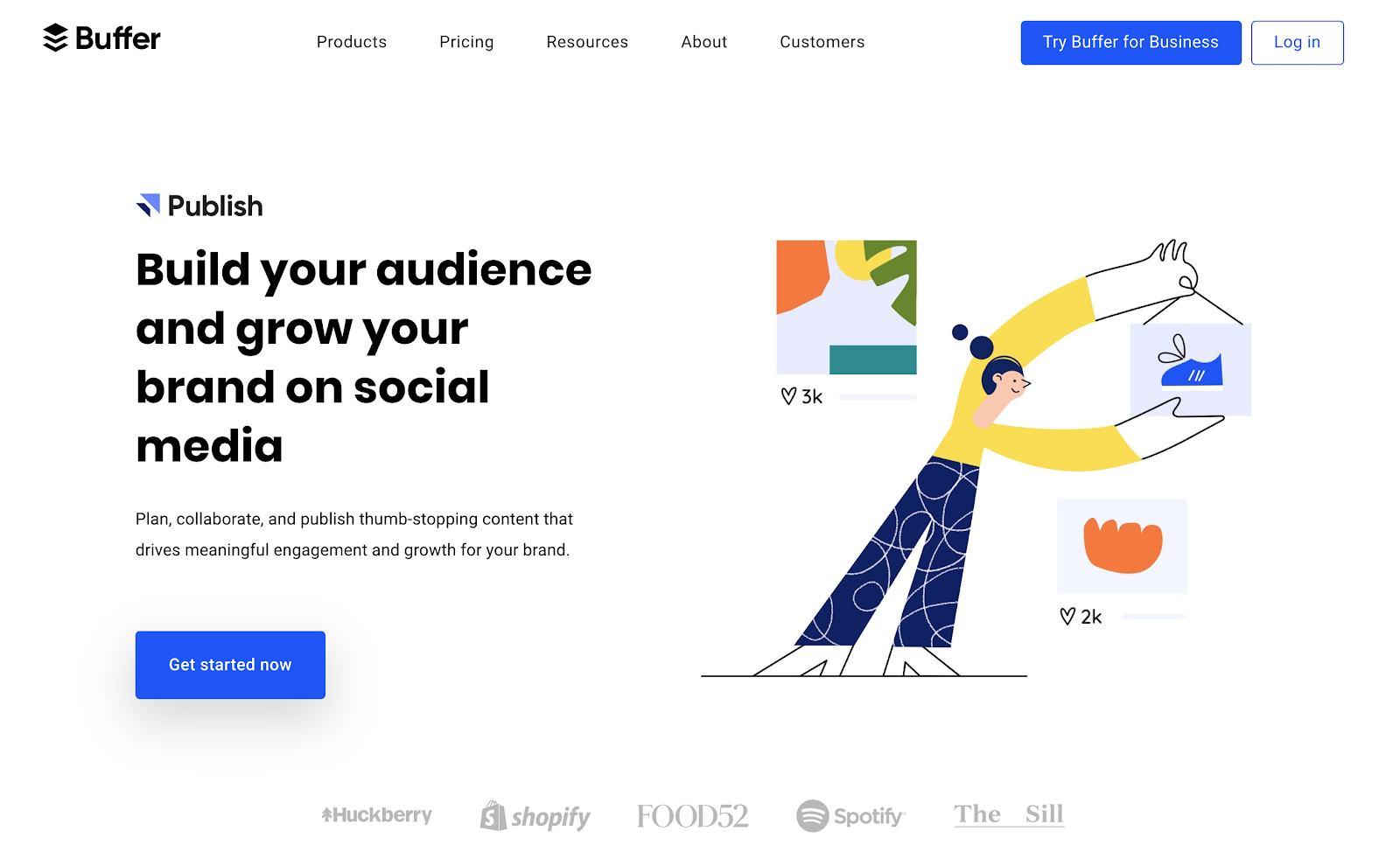
Clear CTAs will help to show what to do next. You don’t want someone to land on your homepage and feel stuck. For example, Buffer features a ‘Get Started Now’ CTA in the hero section of its homepage:
When building your homepage, ensure the user journey is always top of mind and think about where they should be going next.
Every homepage should clearly show your company (or personal) branding. For most readers, this will mean your logo and brand colors. But also think carefully about brand fonts and try to use the same fonts across your website, emails, and social profiles.
A key part of building your brand is making it recognizable. Your homepage should be the best possible example of your brand in action.
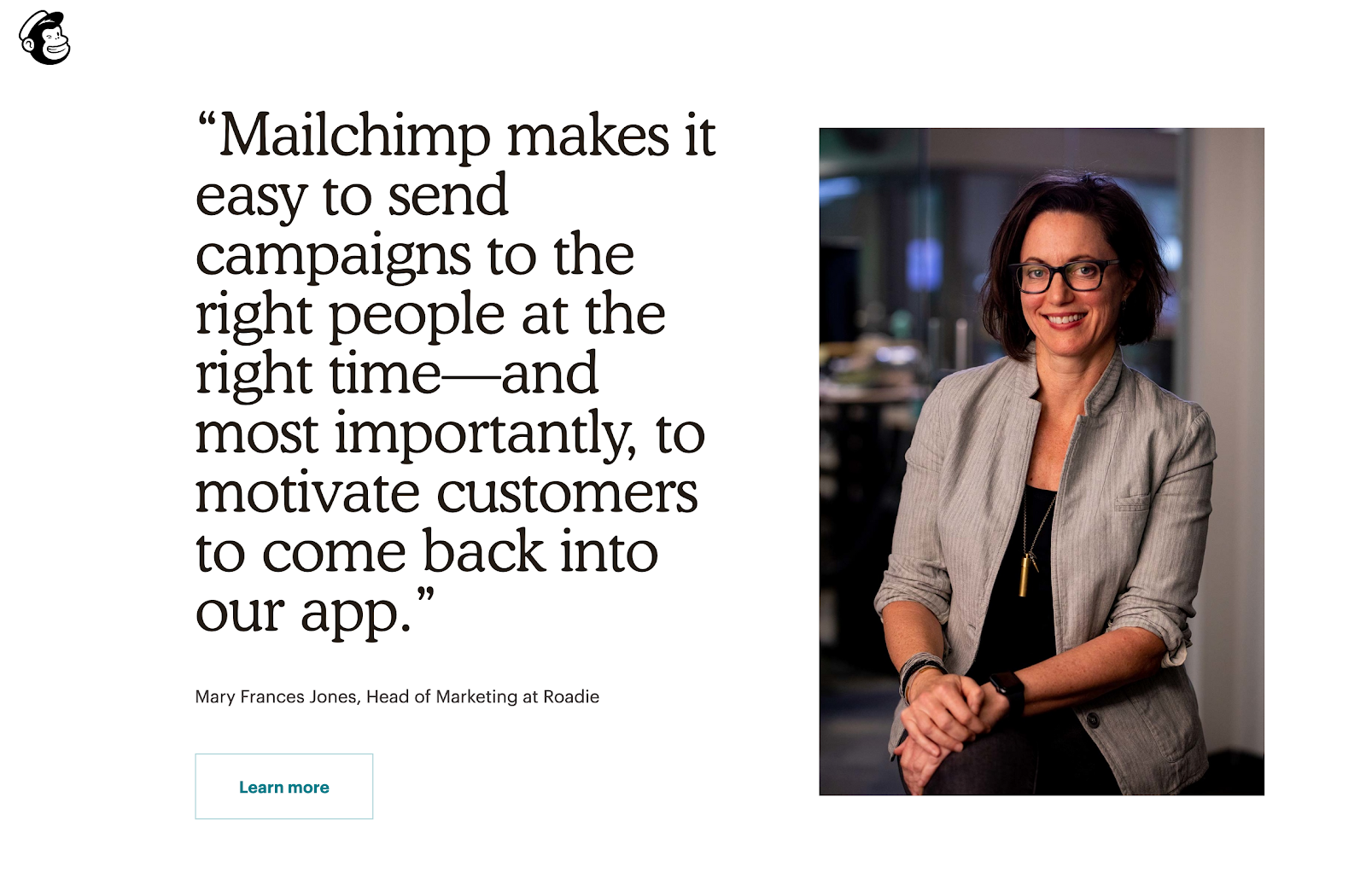
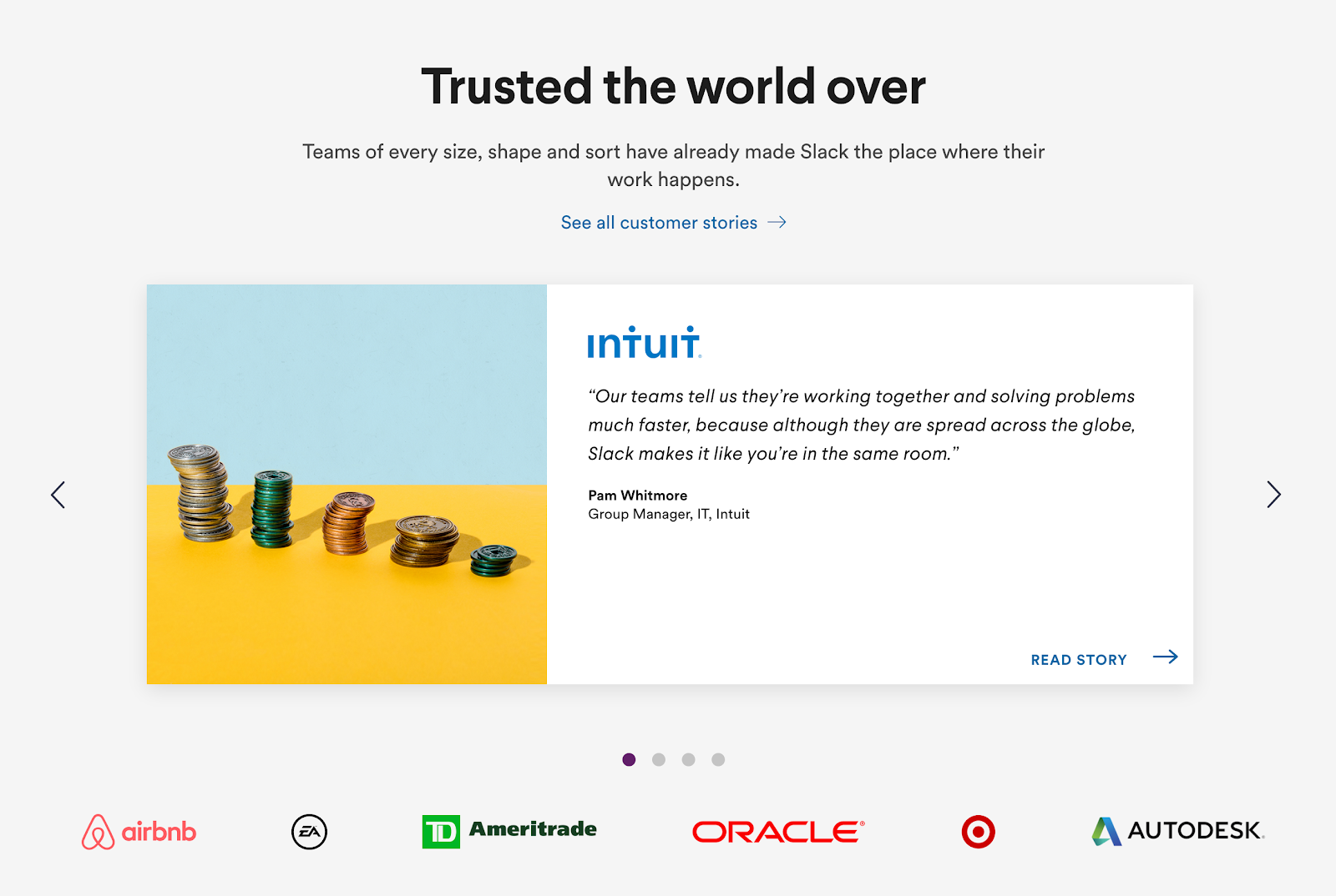
Almost every homepage we’ve discussed today has featured some form of social proof. And that’s not by accident.
Social proof is an incredibly powerful sales and lead generation tool. Here are a few examples of social proof in action:
Mailchimp uses a quote from a customer on its homepage:
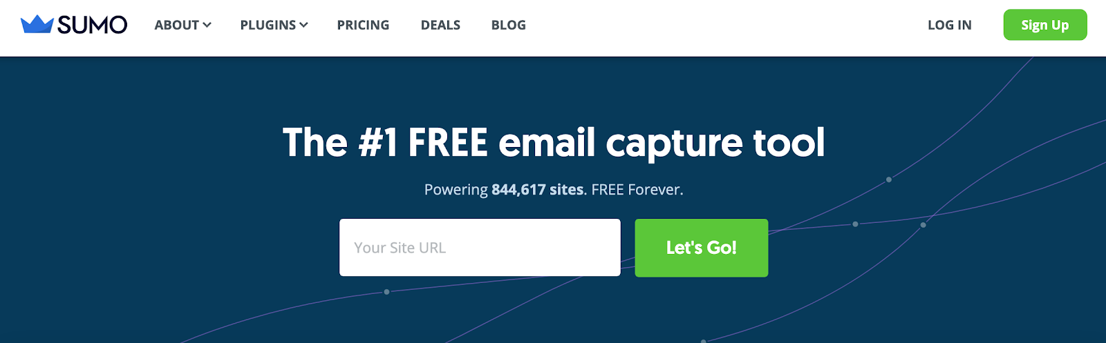
But you don’t have to use quotes. For example, Sumo shows the number of sites using its tools:
And Slack uses a combination of customer case studies and logos of well-known customers:
“What’s in it for me?”
When most visitors land on your homepage, they’ll be asking themselves some form of this question (maybe even subconsciously).
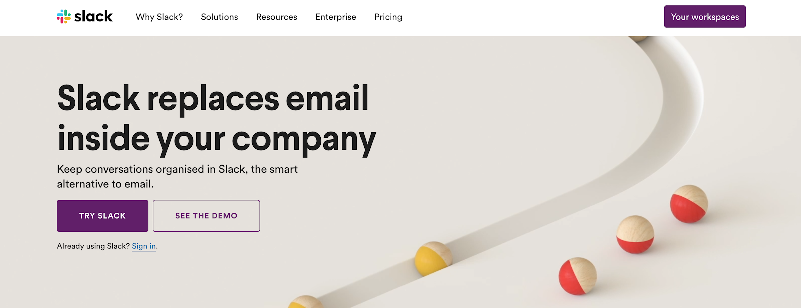
The hero copy on your homepage is key to making a connection with every visitor. You should clearly communicate what your website is about and who it’s for as soon as possible on your page.
For example, when you land on Slack’s homepage it clearly tells you exactly what it does: “Slack replaces email inside your company.”
If you want some tips on writing stand-out copy, check out the guide on Psychological Copy Triggers That Compel People To Buy.
Alongside your copy, you need engaging images on your homepage to give visitors a sense of what your business is about.
Images help to tell your story and show visitors what they can gain from your product. Even just seeing a picture of the person behind the website (in the case of a personal site) can help to build a connection.
Notice how all the personal websites we’ve featured today have an image of a person looking at us at the top of their homepage. From Ryan Robinson:
To Amy Porterfield:
(Also notice how Amy’s eyes are looking directly at the “Hey there” copy to drive our attention toward it.)
For a product website, think about how your images can convey the value of your product and quickly communicate how it will help your visitors to achieve their goals.
Whether you’re looking for inspiration to build a new site, or looking to enhance your current homepage, this guide should have given you plenty to think about.
Remember: A homepage is rarely never fully finished. There’s always something you can A/B test and improve.
Open a new tab, load your website, and think about what you can improve. Focus on:
I bet you can spot at least three quick improvements you can make. Give it a try now.
Comments